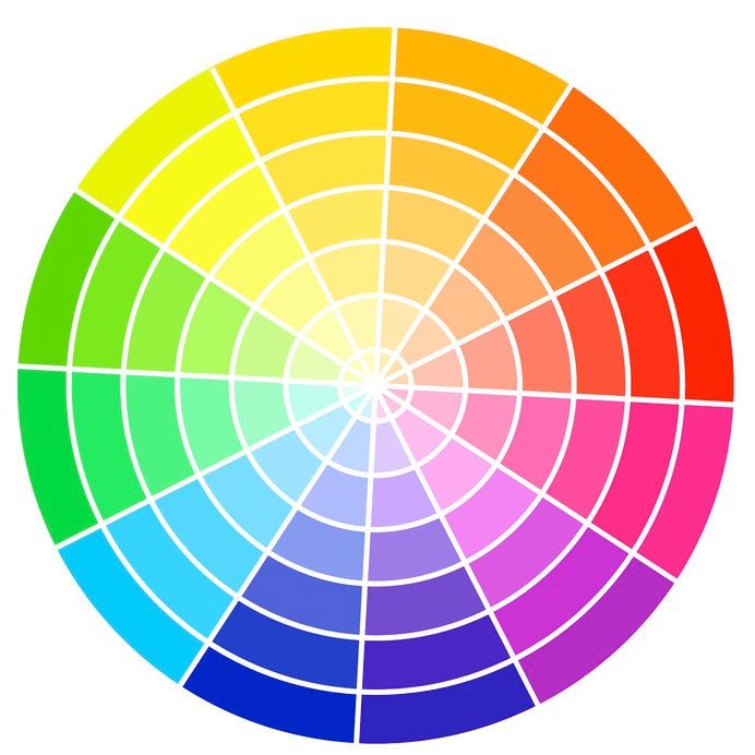
Everyone has a favourite colour. Most people even have favourite colour combinations. But have you ever dared to switch things up? Whether it be an update to an existing room in your home or a complete home renovation, unexpected colour combinations provide a refreshing feel.
Most of us don’t have a background in interior design, and that’s okay. Basic knowledge of colours and how they relate to each other is all it takes to take your project to the next level.
1. Complimentary Colours
Colour wheels are based on the primary colours: red, yellow and blue. Complimentary colours always contain one warm and one cool hue and are two colours with the highest contrast. This combination is one of the simplest schemes because complementary colours are pleasing to the eye, playing off of one another’s intensity. An example of this is blue and orange, a high-contrast combination.
If you choose a complementary colour scheme, be sure to embrace neutrals, as they’ll provide a place for your eye to rest and keep you from becoming overwhelmed by the room.
Teal and red is a refreshing twist on the standard green and red combination. Take the palette of this mid-century kitchen as an example of how to execute on this in your space.
2. Monochromatic Colours
Choosing a single colour is certainly easier than trying to pair two (or more) together. Last year, monochromatic design was up 115% in Pinterest’s spring home trend report. While the idea of decorating with a single colour might make you feel apprehensive, there are ways of creating beautiful spaces using one colour.
One of the key elements to designing a monochromatic scheme is to embrace many variations on the tone and hue of that given colour. Incorporating many textures can keep the space from feeling flat or boring.
Need some inspiration? Check out this Manhattan bedroom.
3. Bold Saturated Hues
Incorporating saturated hues is a great way to change things up. If you have a bold, unique style, using saturated hues could just be the design trend your home is missing. As they say, go bold or go home.
Bringing all of your favourite hues into your home allows for vibrant moments to happen throughout. If your space has a lot of natural light, a darker colour can amplify the room without feeling overpowering. If the space doesn’t have much natural light, opt for brighter colours. These colours will reflect more light and make the bold colour feel inviting instead of overpowering.
4. Metallics
Metallics like gold, silver, and bronze can be worked into any room and any design style. Although copper has been increasingly popular as of late, if you’re looking for a safer investment, try timeless classics. Gold has long been a staple, and it’s not likely to fade from the world of design anytime soon.
Infuse your space with gold lamps or gold-trimmed display shelves. Mix metallics with soft textures like velvet and wool so that the metallic accents contrast and stand on their own.
When incorporating metallics into a room, it’s also important to start small. Metallic ceilings or shiny wallpaper are unique additions, but if you’re easing into the colour scheme, start with accessories first.
Color wheel Image: tuulijumala
